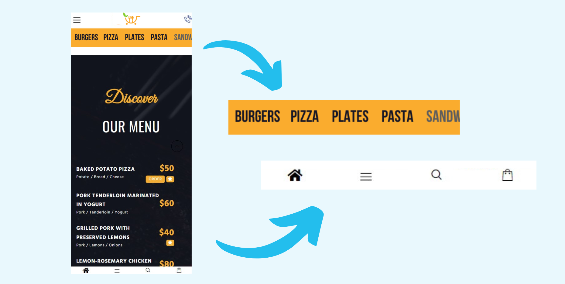
Many e-Commerce websites don’t take full advantage of their mobile-first opportunities, hiding most of their active categories under burger menus and dropdowns. Make sure that your best categories are visible to visitors. For instance, a restaurant delivery online store has two mobile-first navigation menus. The first highlights the restaurants best selling categories in a swipeable bar. The second is an info banner, including a link to your cart, a contact button, and a link to the full menu.
How does it work?
Using e-MARKETER’s HTML editor, we add one stationary banner below the main header, that can be swiped to the right and added all food categories in it. Also, we used a floating popup at the bottom of the screen for the information navigation that scrolls together with the document.
Why?
Creating a mobile-first navigation experience for your visitors ensures that all information you want to give them is visible at any time. This gives your website more clicks and, subsequently, higher revenue.

